Imagine this: you’ve poured your heart and soul into building your Shopify store. You’ve chosen the perfect theme, uploaded your products, and crafted compelling copy. You’re ready to launch and watch the sales roll in.
But then disaster strikes. Your website looks amazing on your desktop. But on mobile? It’s a hot mess. Images are blurry, text is illegible, and the layout is all over the place.
Panic sets in. You’ve invested all this time and effort, and it seems like it’s all been for nothing. Your dream of a successful eCommerce store is on the verge of collapse.
Does this sound all too familiar? You are not alone. In fact, did you know that mobile devices account for a staggering 57.8% of global internet traffic?
With more than half of the world’s online interactions occurring on mobile, it is imperative to overlook the mobile experience for your Shopify store.
Understanding Responsive Design
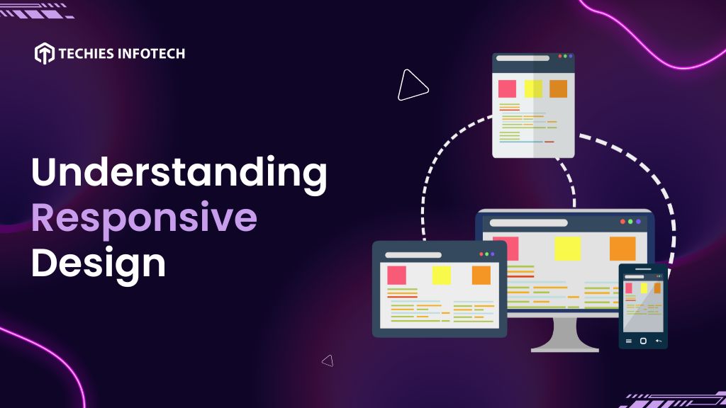
Responsive design is a web design approach to make website pages render for all screen sizes and resolutions, ensuring smooth usability. It is a way to design web pages for multiple devices. The practice of developing a responsive website design includes using a mix of flexible grids, layouts, and images and intelligent use of CC queries.
As the user switches from their desktop to a mobile phone or tablet, the website should be able to accommodate the resolution, image size, and scripting abilities to provide a smoother user experience.
A responsive design is about creating a flexible and fluid layout that responds to the dimensions of the user’s screen. This adaptability is achieved through a combination of design principles, flexible grids, images, and media queries.
- Fluid Grids
Responsive design relies on fluid grids, where the layout elements are sized proportionally rather than using fixed units like pixels. This allows the content to expand or contract based on the screen size, ensuring a harmonious and consistent experience across devices.
- Flexible Images
Images play a crucial role in web design, and in a responsive context, they need to be flexible as well. Using CSS techniques such as setting a maximum width for images allows them to scale down proportionally on smaller screens without losing quality or breaking the layout.
- Media Queries
Media queries are the backbone of responsive design. These CSS techniques enable the application of different styles based on the characteristics of the device, such as screen width, height, or even device orientation. With media queries, developers can tailor the presentation of content for specific devices, ensuring an optimized user experience.
Shopify Themes
A Shopify theme is a pre-designed template that determines the look and feel of your online store. It serves as the foundation for your storefront, dictating the layout, color scheme, typography, and overall design elements. Shopify themes are instrumental in shaping the user experience, offering a seamless and visually captivating journey for your customers as they navigate through your products and services.
Shopify provides a diverse array of themes catering to various industries and preferences. Whether you’re in fashion, electronics, or any other niche, there’s a Shopify theme that aligns with your brand and business goals. These themes can be customized to reflect your unique identity, ensuring that your online presence stands out in the crowded digital marketplace.
Responsive Designing in Shopify Themes
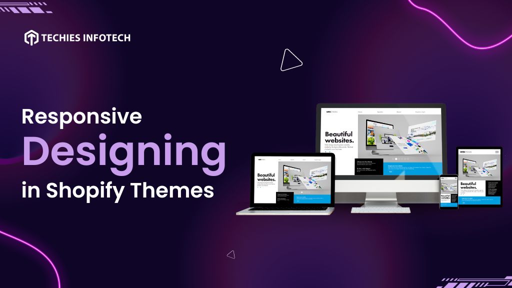
While choosing a visually appealing theme is crucial, ensuring its responsiveness is equally, if not more, important. Responsive design is the key to adapting your Shopify theme to the diverse range of devices that users utilize to access your online store.
A responsive Shopify theme dynamically adjusts its layout and elements to provide an optimal viewing experience on each of these devices. This adaptability is crucial for engaging users and encouraging seamless interactions, regardless of the screen size or device type.
A responsive theme ensures that your online store looks and functions impeccably on any device, eliminating the frustration of distorted layouts or cumbersome navigation experienced by users on non-responsive sites.
Why is Responsive Design Essential for Shopify Websites?
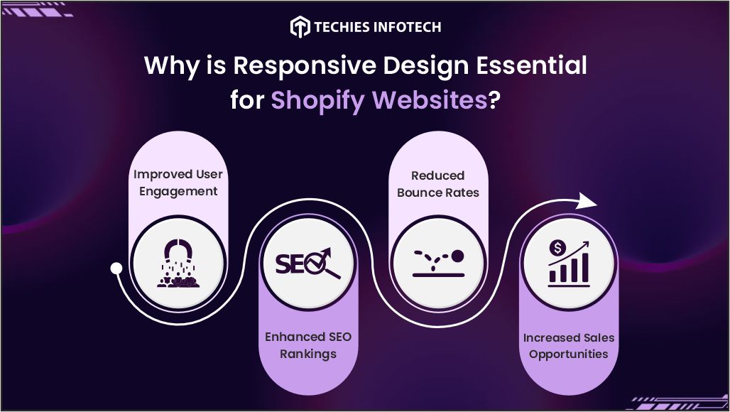
Having a responsive website theme for your Shopify store is essential for delivering a seamless and user-friendly experience across various devices. Here are the benefits of having a responsive design for your Shopify website:
- Improved User Engagement
Responsive design is paramount for Shopify websites as it significantly enhances user engagement. With the prevalence of diverse devices, a responsive theme ensures a seamless and enjoyable browsing experience, adapting effortlessly to various screen sizes.
- Enhanced SEO Rankings
Google’s mobile-first indexing prioritizes mobile-friendly websites, impacting search rankings significantly. With responsive design for your Shopify theme, your store aligns with Google’s criteria, potentially boosting your website’s visibility and attracting more organic traffic.
- Reduced Bounce Rates
Responsive design plays a crucial role in minimizing bounce rates, a key metric that reflects visitor engagement. Inconsistencies in design across different devices can frustrate users, leading them to abandon your site prematurely. A responsive Shopify theme ensures that your website adjusts seamlessly to various screen sizes, providing a cohesive and enjoyable experience.
- Increased Sales Opportunities
The ultimate goal of any Shopify store is to drive sales, and responsive design is a linchpin in achieving this objective. By providing a user-friendly experience across devices, responsive themes remove barriers to conversion. Whether a customer is browsing on a desktop, tablet, or smartphone, a responsive design ensures a smooth transition from exploration to checkout. This, in turn, maximizes the chances of turning visitors into satisfied customers, unlocking new sales opportunities for your Shopify store.
Mastering Responsive Design in Shopify Themes
To master responsive design in Shopify themes, you need to follow a systematic approach that ensures your online store is optimized for a seamless experience across various devices. Here is a step-by-step guide to mastering this crucial aspect of e-commerce
- Choosing a Responsive Shopify Theme
The foundation of a responsive design starts with selecting a theme that is inherently responsive. Shopify offers a variety of themes, and it’s essential to choose one that not only aligns with your brand aesthetics but is also designed to be responsive across different devices. Look for themes that explicitly mention responsiveness in their features and have a mobile-friendly design preview.
- Optimizing Images for Different Devices
Images are an integral part of the online shopping experience, but they can also be a source of performance issues on mobile devices. Optimize your product images to ensure they load quickly without compromising quality. Use image compression tools and consider creating different image sizes for various screen resolutions, ensuring a smooth and fast-loading experience for users on both desktop and mobile devices.
- Prioritizing Mobile Navigation Design
Navigation is a critical aspect of user experience, and it becomes even more crucial on mobile devices where screen real estate is limited. Optimize your navigation menu for mobile users by implementing a clean and intuitive design. Consider using a hamburger menu icon to save space and only display essential navigation options. Test your mobile navigation thoroughly to ensure that users can easily find what they’re looking for and navigate through your site seamlessly.
- Testing Across Multiple Devices and Browsers
Responsive design is not a one-size-fits-all solution, and testing is paramount to ensure that your Shopify theme performs optimally across various devices and browsers. Use testing tools and emulators to simulate different screen sizes and resolutions. Additionally, conduct real-world testing on actual devices to identify any issues that may arise in specific scenarios. Regular testing helps you catch and address responsive design issues before they impact the user experience.
- Enabling Accelerated Mobile Pages (AMP)
Accelerated Mobile Pages (AMP) is an open-source initiative designed to improve the performance of web content on mobile devices. Implementing AMP for your Shopify store can lead to faster page load times, reduced bounce rates, and improved SEO rankings. Shopify offers AMP support, allowing you to create mobile-optimized versions of your product pages for an enhanced mobile browsing experience.
- Utilizing Responsive Typography
Typography plays a crucial role in the readability and aesthetics of your website. Ensure that your Shopify theme uses responsive typography that adjusts based on the user’s device. Consider using relative units such as percentages or ems for font sizes, ensuring a consistent and visually pleasing text display across different screens. Responsive typography contributes to a more polished and professional appearance for your online store.
- Optimizing Checkout Process for Mobile Users
The checkout process is a critical juncture in the customer journey, and it’s essential to optimize it for mobile users. Streamline the checkout form, minimize the number of steps, and implement mobile-friendly input fields. Test the entire checkout process on various devices to identify and address any usability issues that may arise. A Smooth and efficient checkout experience on mobile devices can significantly impact conversion rates.
- Monitoring and Analyzing User Behavior
Responsive design is an ongoing process that requires continuous monitoring and optimization. Leverage analytics tools to track user behavior and identify areas that may need improvement. Pay attention to metrics such as bounce rates, time on site, and conversion rates for different devices. Use this data to make informed decisions and implement further enhancements to your responsive Shopify theme.
Conclusion
Mastering responsive design in Shopify themes is pivotal for ensuring a seamless and enjoyable shopping experience for users across diverse devices. By following the step-by-step guide outlined above, you can empower your Shopify store to adapt to the evolving landscape of e-commerce.
Incorporating responsive design into your Shopify store not only enhances user satisfaction but also contributes to improved SEO rankings, reduced bounce rates, and increased sales opportunities, solidifying your position in the competitive online marketplace.
Optimize your eCommerce journey with Techies Infotech, your trusted Shopify Services Provider in Mohali. Boost your online presence and enhance user experiences with our expert Shopify solutions. Connect with us today for seamless Shopify experiences tailored to your business needs.


